
If your printed feather flag looks great on-screen but comes back with soft edges, cramped text near the sleeve, or colors that feel “off,” it’s rarely the printer’s fault—or the designer’s talent.
It’s usually a file-prep problem.
This guide is built for event and field marketing teams who need a print-ready file that survives real production: cutting, stitching, sleeves, and outdoor viewing in motion.
Key Takeaway: The fastest way to get a clean printed feather flag is to design on the correct template, keep critical elements out of sleeve/stitch zones, and submit vector-based artwork whenever possible.
Key takeaways (save this before you send files)
Start with the correct feather flag banner template (it should show the cut line, safe zone, and stitch/sleeve areas).
Use vector files (AI/EPS/PDF) for logos and text; outline fonts to avoid substitution.
If you must use raster images, they need to be high-resolution at the final print size (not pulled from a website).
Keep the message short and high-contrast—feather flags are read at distance and in motion.
Treat proofing as your risk-control step: check the sleeve/stitch zones, readability, and key brand colors before approving.
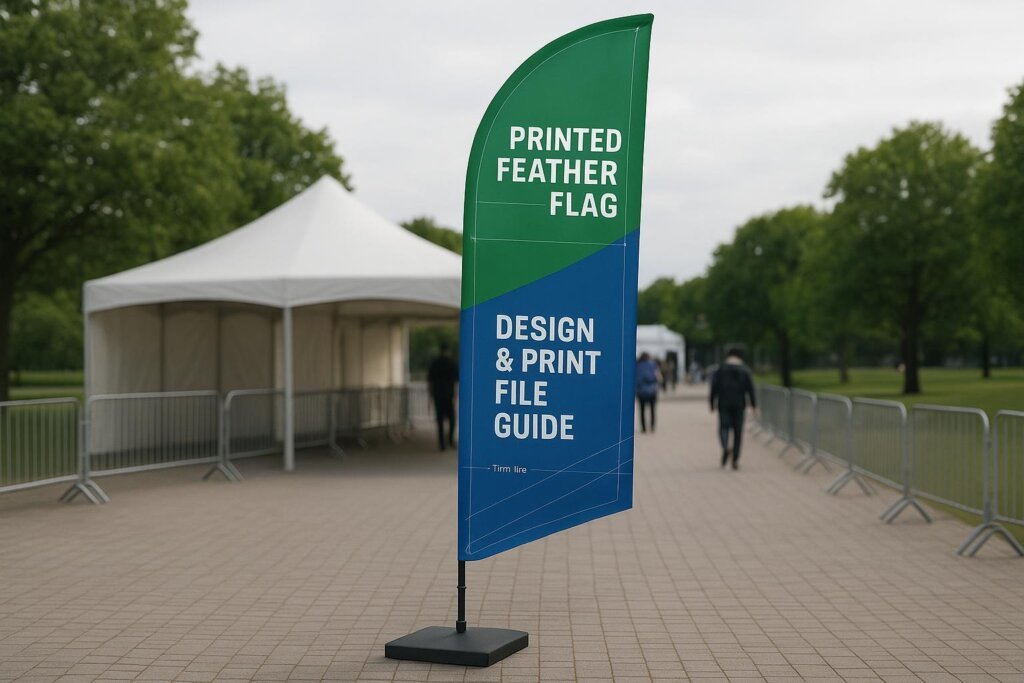
Start with the feather flag banner template, not a blank canvas
A printed feather flag isn’t a rectangle. The curved top and the pole sleeve mean “perfectly centered” designs can become “half-hidden” designs once the flag is sewn and installed.
A good feather flag banner template should clearly show:
Cut/trim line (final shape after finishing)
Safe zone (where logos and text should live)
Stitch line and sleeve area (areas that will be stitched or wrapped around the pole)
Even if you’re working with a designer, ask for the template early—before anyone commits to a layout.
Vector vs raster: what to submit for a crisp printed feather flag
Feather flag artwork requirements are mostly about two things: sharpness (vector vs raster) and production reality (safe zones, sleeves, and stitching).
The single biggest driver of sharpness (especially for logos and type) is whether your artwork is vector or raster.
When vector is non-negotiable
If your file has any of the following, you want vector:
Logos
Text
Icons
Simple shapes or solid-color graphics
Many flag suppliers recommend vector formats (AI/EPS/PDF) and explicitly call out outlining fonts so the file prints exactly as designed; see Custom Flag Company’s art requirements (2025). (We’ll refer back to this guidance later without re-linking.)
What to do before you export:
Convert text to outlines (or embed fonts correctly).
Make sure linked images are embedded (so nothing goes missing at prepress).
⚠️ Warning: Don’t send an “editable” file with missing fonts or linked images. It often looks fine on your computer and breaks the moment it’s opened on another system.
Raster images: what “high resolution” actually means
Raster artwork (JPG/PNG) can work when it’s truly high resolution—but feather flags are large. A small web graphic stretched to flag size will blur.
Different print providers publish different thresholds. For example, instantprint’s flag setup guide recommends at least 150 DPI at actual print size and emphasizes working inside safe zones and stitch lines using templates; see instantprint’s printed flags artwork setup guide (2024).
Other vendors recommend 300 DPI at actual print size for raster elements, especially when you want crisp detail (as noted earlier in Custom Flag Company’s art requirements).
A practical rule for teams:
Use vector whenever you can.
Use raster only for photos or complex textures—and only if you have the original, high-res source.
Safe zones, sleeves, and stitch lines: the feather-flag gotchas
Your printed feather flag will be cut and finished, then attached to the pole. That finishing process is where many “last-minute surprises” come from.
Here’s what to plan for in the layout:
Pole sleeve overlap: the sleeve area is not a safe place for small text or thin design details.
Stitch line: stitching can visually compete with thin lines or tiny type.
Curved top: centering a logo visually often requires moving it slightly lower than you’d expect in a rectangular layout.
If you’re not sure what your supplier’s sleeve/stitch zones look like, ask for:
a template for your exact size and shape
a proof that clearly shows the seam/sleeve region
Feather flag design that stays readable in motion
Even with perfect print files, feather flags have a built-in challenge: they move.
A “great poster design” can turn into an unreadable feather flag design because the viewer is:
walking or driving past
reading from 15–50+ feet away
seeing the flag curve and flutter
A few proven constraints help:
Keep the headline short (often 3–5 words)
Use bold, thick fonts (thin serifs and scripts tend to fail)
Avoid thin lines under roughly 1.5–2pt at final scale
Those guidelines are called out in advertising-flag artwork guidance like PromotionChoice’s advertising flag artwork guide (2026). (We’ll refer back to it later without re-linking.)
Layout tips that usually work
Put the logo in the upper third so it sits above heads and visual clutter.
Choose one “primary message” (sale, location, brand) and support it with minimal secondary text.
Use high contrast (dark on light, or light on dark) so the message holds up outside.
Pro Tip: If you can’t read your design clearly when it’s shrunk to phone-screen height, it won’t read well on a moving flag at distance.
Color on fabric: what to expect with feather flag printing
Fabric printing isn’t a perfect match to what you see on a backlit monitor. Even with modern digital methods, color can shift slightly.
Vancke notes that with digital heat transfer printing there can be occasional color matching differences between what you see on a computer and what prints, which is exactly why proofing matters; see Vancke’s digital heat transfer printing overview.
To reduce surprises:
Avoid super-subtle gradients for critical brand elements.
Keep brand colors bold and well-separated.
If a specific shade is critical, tell your supplier up front and confirm how they handle matching.
Pre-flight checklist before you upload your printed feather flag artwork
Use this as a final gate—especially when you’re working against an event deadline.
Correct template: You designed on the right size/shape template.
Safe zone respected: No critical text or logos near sleeve/stitch areas.
Vectors for logos/type: AI/EPS/PDF preferred; fonts outlined.
Raster is truly high-res: No website images stretched up.
Contrast check: Readable from distance; minimal words.
Double-sided logic (if applicable): You confirmed how side B is handled (mirrored/aligned).
Export sanity: Embedded images, no missing links, no unlicensed fonts.
Proofing workflow: what to check before you approve
Proofing is where most production mistakes get caught—if you know what to look for.
Vancke’s process emphasizes receiving a digital proof for confirmation and approving it before printing; see Vancke’s custom feather flags process and Vancke’s how-to-order steps. (We’ll reference these pages later without re-linking.)
When you review the proof, check:
Sleeve/stitch zones: nothing critical disappears into finishing.
Spelling and phone numbers: obvious, but still the most common pain.
Logo crispness: no pixelation on edges.
Contrast: the main message reads instantly.
Color expectations: confirm any key brand colors look reasonable for fabric.
And when you approve, be explicit in your reply (so there’s no ambiguity):
“Approved for print”
the quantity and size
any required deadline notes
<div data-type="node-video" data-provider="youtube" data-url="https://www.youtube.com/shorts/SHJOQHVbxRQ" data-embed-url="https://www.youtube.com/embed/SHJOQHVbxRQ"></div>
Next steps
If you want a second set of eyes before you submit files, a supplier that offers file checks + proof approval can reduce reprints and deadline risk.
If you’re ordering a printed feather flag and want a proof-first workflow, start with Vancke custom feather flags.
For timelines and what happens after you approve the proof, see Vancke’s how-to-order steps and Vancke’s free shipping details.
FAQ
What’s the best file format for a printed feather flag?
Vector formats (AI/EPS/PDF) are best for logos and text because they scale without getting blurry. If you submit raster files, they need to be high-resolution at final size.
What resolution do I need for feather flag printing?
It depends on the printer, but the safest approach is: use vector for anything that must be crisp, and only use raster images when you have a high-resolution original. Some print guides cite 150 DPI at print size as a minimum for flag artwork, while others recommend 300 DPI for the cleanest detail.
Why does my design look different once it’s printed on fabric?
Fabric doesn’t display color the same way a backlit screen does, and some printing methods can shift colors slightly. Proofing is the best way to confirm the expected look before production.
Should I put a QR code on a feather flag?
You can, but it needs to be large, high-contrast, and placed well inside the safe zone. Also consider whether your audience will realistically have time and distance to scan while walking by.
Single-sided vs double-sided: does it change my artwork?
Yes. Single-sided flags may show a mirrored version on the back, while double-sided flags require planning for alignment and how each side will read in real placement.